/filters:quality(80)/fit-in/630x380/blog/image-1758799744.png "Best Logo Placement on Shirts: A Quick Guide")
You’ve been there. The boxes arrive with custom shirts or team uniforms for your big event. You pull one out, excitement building, only to feel your stomach drop. The logo isn’t just off-center; it’s noticeably crooked, and that initial excitement curdles into disappointment.
A simple mistake in logo placement can undermine your entire investment and make your brand look careless. However, when executed correctly, logo placement can enhance professionalism and brand recognition.
This isn't just a feeling; it's a measurable brand identity perception issue, shaped by factors in logo placement and demographic and trend influences. A misaligned logo can instantly devalue the garment and the organization it represents.
The Promotional Products Association International (PPAI) reports that "90% of Gen Z consumers are likely to recommend brands with high-quality promo products."
Achieving that quality is a science, not a secret, and this guide will walk you through how to get it right every time, aligning logo placement for brand goals with placement for brand impact.
Why Logo Placement for Brand Really Matters
It might seem like a minor detail, but the precise location of your logo has a major impact. Getting it right goes far beyond simple aesthetics; it’s a critical component of your branding strategy where logo placement boosts memorability through thoughtful contextual factors in logo execution. This is especially important for educational institutions that must follow campus logo usage guidelines to protect brand integrity.
A well-placed logo looks intentional and professional, reinforcing the quality of your brand and drawing the eye naturally without being distracting.
Proper placement also considers the wearer's comfort and how the fabric drapes and moves. That is why shirt style or fabric choices matter. The style or fabric affects logo placement on the shirt, playing a key role.
According to a study published in the National Library of Medicine, "symmetrical logos significantly enhance perceived product quality compared to asymmetrical logos."
At Swagprint.com, every order gets a human placement review to ensure your final product is flawless and represents your brand with the quality it deserves.
- • Brand Visibility & Professionalism: Correct placement ensures your logo is seen clearly, reinforcing a polished and credible brand image.
- • Wearer Comfort: Placing a logo away from areas of high friction or awkward folds makes the shirt more comfortable to wear.
- • Garment Longevity: Proper placement avoids high-stress areas, helping prints and embroidery last longer through washes and wear.
- • Perceived Product Quality: A centered, level logo signals attention to detail, elevating the perceived value of the shirt and your organization.
|
Key Insight: Great logo placement isn't just aesthetic—it’s strategic, using strategic placement alternatives beyond the obvious to support your message. It signals professionalism, ensures maximum visibility, and impacts wearer comfort and garment longevity. It's a small detail that communicates your brand's commitment to quality. |
Key Terminology & Sizing Basics
Before we dive into measurements, let's get on the same page with some industry-standard terms. Understanding this vocabulary will help you communicate your vision clearly and master the art of placement with data-driven placement strategies.
|
Term |
Definition |
|---|---|
|
Anchor Point |
The reference point on the shirt from which all measurements are taken is typically the collar's highest point. |
|
Print Area |
The total surface on the garment where a design can be applied. |
|
Safe Zone |
The ideal portion of the print area where a logo will look best, avoiding seams and edges. |
|
Vertical Offset |
The distance is measured from the anchor point to the top of your design. |
|
Max Imprint |
The largest possible design dimensions can be for a specific garment size and printing method. |
For quick explanations of style terms and more terminology, visit the glossary of terms.
Shirt Logo Placement Strategies & Standard Measurements
While creativity is encouraged, most professional logo placement falls into a few standard locations. These industry-tested spots are optimized for visibility and a clean, professional look. Here’s a breakdown of the most common options with standard measurements for adult-sized shirts.
Left-Chest Placement
The undisputed classic for corporate and casual wear, the logo is professional, subtle, and ideal for polo shirts, button-downs, and corporate t-shirts. The classic left chest placement dominates, as the goal is to align the logo over the wearer's heart.
- • Width Range: 3″ – 4″ wide
- • Vertical Offset: 7″ – 9″ down from the shoulder seam next to the collar, typically measured from the shoulder's left seam for consistency.
|
Pro Tip: Align the vertical center of the logo with the edge of the collar, following the rules by placement location. |
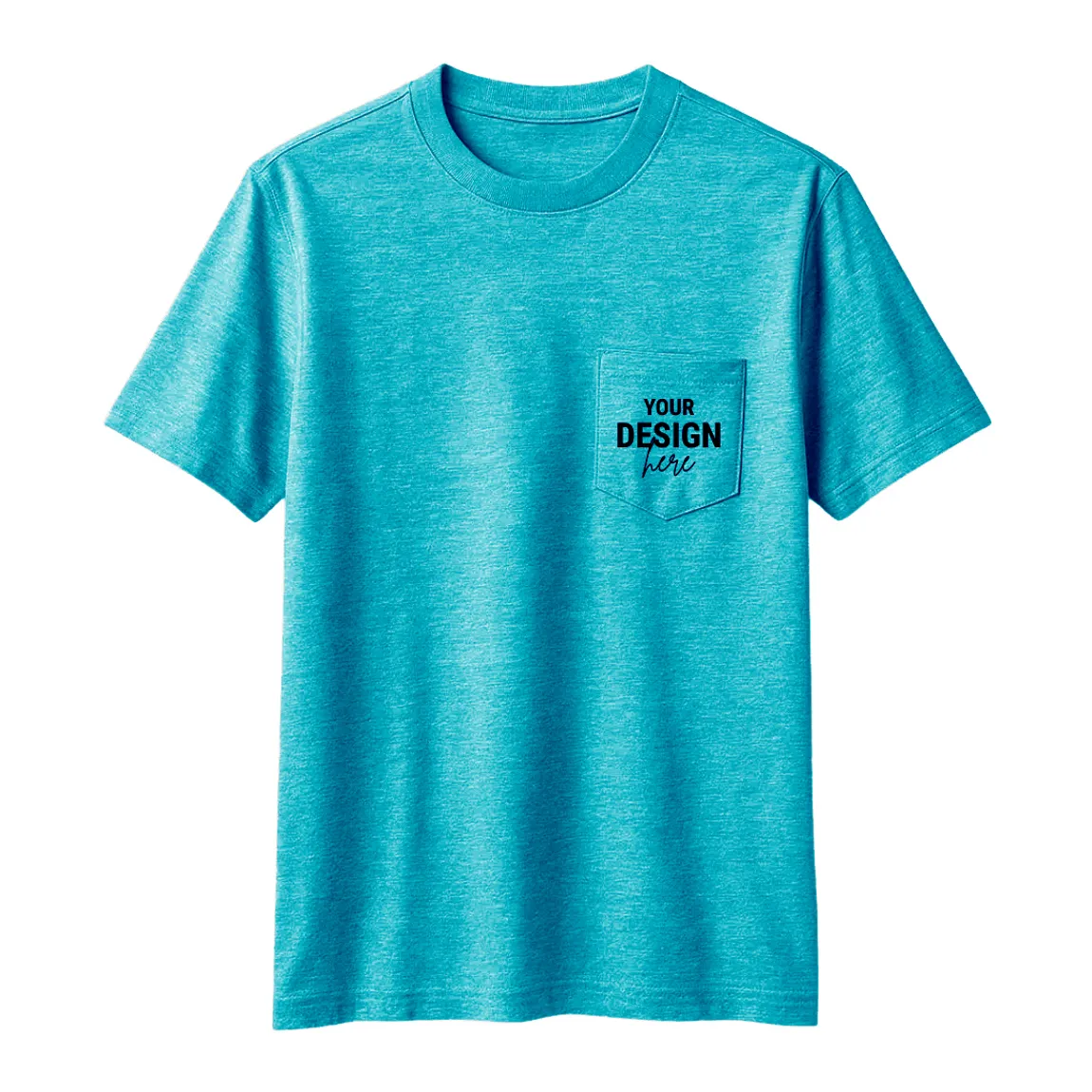
Gildan® - DryBlend® 50 Cotton/50 Poly Pocket T-Shirt
Center Chest Placement
Bold and impossible to miss. This placement is perfect for event t-shirts, promotional giveaways, and designs that must make a big impact, a classic example of placement alternatives beyond the left chest placement. It provides a large canvas for more creative graphics.
- • Width Range: 8″ – 10″ wide
- • Vertical Offset: 3″ – 4″ down from the bottom of the collar.
- • Pro Tip: For V-necks, measure from the lowest point of the 'V' instead of the collar seam.
Full Front Placement
This placement has the maximum impact for retail merchandise, band tees, and artistic designs. It uses the majority of the shirt’s front, allowing for large, detailed graphics.
- • Max Imprint: Up to 12″ wide × 16″ high on standard adult shirts.
- • Vertical Offset: Typically starts 2" - 3" below the collar.
Upper Back (“Locker Patch”) Placement
A secondary branding location often used on team uniforms or company work shirts. It sits just below the collar, where a locker tag might be, near the nape of the neck and back collar and is easy to align with sleeve and nape positioning.
- • Width Range: 3″ – 4″ wide
- • Vertical Offset: About 1″ below the collar seam.
Full Back Placement
This is ideal for security staff, event volunteers, or shirts that list sponsors. It provides the largest possible print area on a garment.
- • Max Imprint: Up to 14″ wide on most adult shirts.
- • Vertical Offset: Starts about 3″ – 4″ down from the collar.
Sleeve Design Placement
A modern and stylish option for adding a secondary logo or design element that can deliver a side logo placement boost to brand visibility and recall. It's commonly seen on both short and long-sleeve shirts.
- • Width Range: 3″ – 3.5″ wide
- • Placement: Centered on the bicep area, about 1" above the sleeve hem on short sleeves.
Decoding Shirt Logo Placement: Quick-Reference Guide
|
Placement |
Width Range |
Vertical Offset (from Collar) |
Best Garment |
Common Printing Methods |
|---|---|---|---|---|
|
Left-Chest |
3" - 4" |
7" - 9" down |
Polos, Corporate Tees, Jackets |
Embroidery, Screen Print |
|
Center Chest |
8" - 10" |
3" - 4" down |
Event Tees, Promotional Shirts |
Screen Print, DTG |
|
Full Front |
≤12" |
2" - 3" down |
Retail Merch, Band Tees |
DTG, Screen Print |
|
Upper Back |
3" - 4" |
1" down |
Uniforms, Staff Shirts |
Screen Print, Heat Transfer |
|
Full Back |
≤14" |
3" - 4" down |
Event Staff, Security, Sponsor Tees |
Screen Print |
|
Sleeve |
3" - 3.5" |
Centered on the bicep |
All Shirts (Short & Long) |
Embroidery, Heat Transfer |
|
Pro Tip: Match your placement to your purpose. Use the subtle left chest shirt logo placement for professional corporate branding and the bold center chest for high-impact promotional event shirts, or combine multiple logo placements to support multi-message campaigns. The location should always support the message. |
Artwork Prep & Technical Specs
Even the best placement can be ruined by a blurry, pixelated logo. Submitting high-quality artwork is non-negotiable for a professional result. The fundamental rule is to start with a crisp and clear file at the size you want printed.
For the best quality, use a vector file (formats like .AI, .EPS, or .PDF). If you must use a raster image (like a .JPG or .PNG), ensure it has a resolution of at least 300 DPI.
Also, consider your colors; a study highlighted on EurekAlert! stated that "blue logos invoked feelings of confidence, success and reliability."
|
Important: Perfect placement cannot save a pixelated logo. Always submit high-resolution vector files (.AI, .SVG) or 300 DPI raster images. Low-quality art will result in a low-quality, unprofessional final product, guaranteed. |
Alignment Tools & Production Aids
In a professional print shop, precision is key. We use a variety of tools to ensure consistency in every shirt in a run.
For DIYers, tools like t-shirt ruler guides can help you find the center line and proper vertical offset. In production, we use high-tech aids like laser alignment systems on our printers, which project a grid onto the garment for perfect positioning. For embroidery, magnetic hoops hold the fabric taut and prevent shifting during stitching.
Shirt-Specific Fit Tweaks
The standard rules are a great starting point, but different garment styles require minor adjustments for a truly polished look. A "one-size-fits-all" placement strategy often fails because shirt cuts and features vary significantly. Adapting your logo placement to the specific garment is the mark of a pro.
- • Polo Shirts: The placket (the strip with the buttons) is your best guide. For a left-chest logo, the horizontal center of your design should align with the center of the placket.
- • Hoodies: The biggest obstacle is the large front pocket. Always place your main design well above the pocket seam to prevent distortion.
- • Women's & Youth Sizes: Don't use the same logo size on an adult XL and a youth small. Scale down the logo and placement measurements proportionally.
- • V-Necks: Your vertical anchor point changes. Instead of measuring from the top of the collar, start your vertical measurement from the lowest point of the 'V'.
|
Pro Tip: Don't use a 'one-size-fits-all' approach. A pro always adjusts placement for the specific garment—accounting for a polo's placket, a v-neck's drop, or a hoodie's pocket. Context is everything for a polished look. |
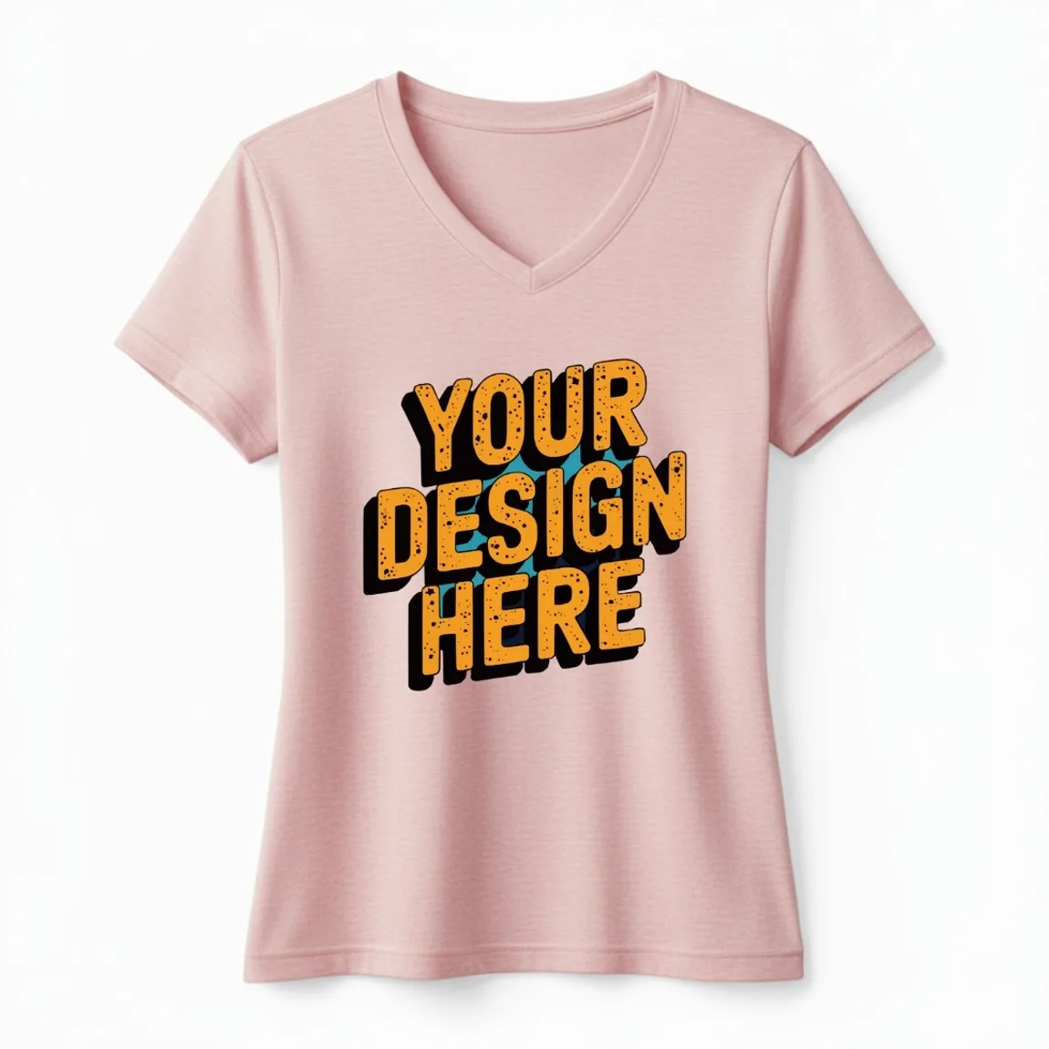
Port & Company ® Women Fan Favorite ™ Blend V-Neck T-Shirt
Get It Right, Every Time
Perfect logo placement on a shirt is the final, crucial step that transforms a simple garment into a powerful branding tool. By understanding the core principles of placement, sizing, and printing methods, you can create professional-quality apparel that makes your organization shine. You don't have to be a design expert to get an expert result.
Swagprint.com's platform is designed to make this process foolproof. From our easy online ordering process to our expert review of every order, we ensure your vision comes to life flawlessly. Ready to create apparel you’ll be proud of?
Frequently Asked Questions
How many inches down should a center chest logo be on a youth medium shirt?
A good rule of thumb is to scale down adult measurements. For a youth medium, start roughly about a couple of inches below the collar.
How do I ensure consistent logo placement across different colored shirts?
Use the same measurements regardless of shirt color, but be aware that logos may appear slightly different on dark vs. light backgrounds. Always request a sample or digital proof for each color variation.
What’s the typical turnaround time?
It’s fast! Digital proofs are usually sent once you submit your order. Once you approve, production times vary, but we offer rush services and have 24/7 customer support to help you meet your deadline.